

In the digital world that we live in, data can be collected for just about anything! However, data does not tell us much until it is organized in a meaningful way.
Graphs are created with data to tell a visual story, so trends and patterns can be recognized and acted upon. In this video, we will discuss a particular type of graph, called a line plot, that organizes numeric data values for easy interpretation.
Numerical vs. Categorical Data
Data is classified as either numerical or categorical. Other terms that you may hear about in your courses are quantitative or qualitative, respectively. Identifying the type of data that you have is important because there are specific graphs that are used for numerical data, and others are used for categorical data.
An easy way to determine whether or not data is numerical is to ask yourself, “Can I do math with this data?” For example, a data set of heights is numeric because an average height can be calculated by adding all of the heights and dividing by the number of heights that were recorded.
Conversely, if I were to collect data based on hair color and I had a random list of “brown”, “blonde”, etc., I would quickly realize that an “average” hair color is not meaningful. This data is characterized as categorical, as it is organized by a qualitative feature, not a quantitative value, such as height.
Now, we could break down both numerical and categorical data further, but for today, we will only look at the two different types of numerical data: discrete and continuous.
Discrete Data
Discrete data are specific values. For example, the data may represent counts of students at various ages. In contrast, an example of continuous data would be the measured heights of the students at various ages.
Continuous Data
Continuous data can take on any of the infinite number of values within a range of values. Line plots are used to display numerical, discrete data only, not the continuous data.
Line Plots
Line plots organize the data by indicating the occurrences of each value on a number line. These graphs are easily constructed with small data sets, and allow for interpretation based on the frequency patterns that are revealed.
Let’s look at a few examples.
Example #1
Suppose a teacher at school created a survey for the students in her class to complete. The survey asks many different types of questions, so there is a lot of data to analyze.
You are particularly interested in Question #3: “How many texts did you send during lunch?” Of the 18 students in her class, she received the following answers:
3, 4, 1, 3, 3, 2, 0, 9, 0, 0, 4, 1, 2, 3, 3, 1, 1, 3
This string of digits does not really provide much information, but organizing it on a line plot will create a clear picture of the texting habits of her students during lunch. Let’s make this line plot together.

First, we need to create a number line that allows for the range of values of the data. In this case, let’s put 0 through 10. Above this number line, we’ll put an “x” for each data point, with any repeats being marked above the previous one. Let’s work through our string of numbers from left to right, marking our line plot as we go.

Alright, now that we’ve plotted our data onto this graph, there are several things we begin to notice about the data. For instance, almost all of the students sent less than 5 texts during lunch. Three students did not send any texts during lunch, and one student sent 9 texts. If you do a little math, one-third of the students texted three times during lunch, while half of the students texted less than three times.
As you can see, when the data is organized this way, important statistical concepts are revealed, such as data clusters, mean, median, mode, and outliers.

All of these values can be determined with a line plot because individual data points are visible.
Example #2
Let’s analyze one more line plot before we go:

What information can we gather from this graph? Well, we can see this is graphing how many minutes it takes people to eat breakfast. Six of the 40 people that were surveyed do not eat breakfast at all, while one person takes their time with 12 minutes each morning. We can also see that the number of people who take 5 minutes or less to eat breakfast is about the same as the number of people who take at least 8 minutes.
As you can see, using a line plot to organize data can simplify the interpretation of the data and reveal some important statistical concepts that you might otherwise have missed.
I hope this review was helpful! Thanks for watching, and happy studying!
Line Plot Practice Questions
Jordan asks all of the students in his class what their favorite sport to play at recess is. He creates a line plot with the data that he collects. In Jordan’s class, what is the most popular sport to play at recess?
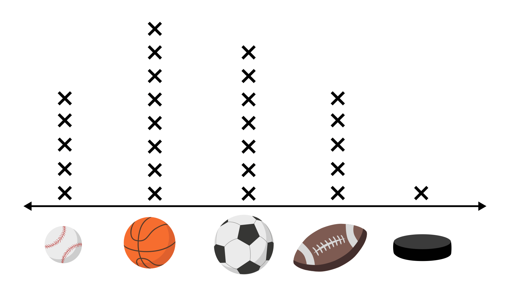
There are eight marks above the basketball option, indicating eight votes. Basketball has more votes than any other option, so in Jordan’s class it is the most popular sport to play at recess.
Brandon asks all of his friends how many times they play video games each week. Each x in the line plot represents one friend. How many of Brandon’s friends said they played video games more than twice per week?

Each \(x\) on the line plot represents one of Brandon’s friends. The graph shows that eight of his friends said they played video games three times per week, and two of his friends said they played video games four times per week. This means that a total of ten of his friends played video games more than twice each week.
Andy is recording the number of cars sold each day at his car dealership. He is curious to see if he recognizes correlations between the day of the week, and the number of cars sold. The line plot below represents his data from last week, where each \(x\) represents one car sale. Which statement is false based on the line plot?
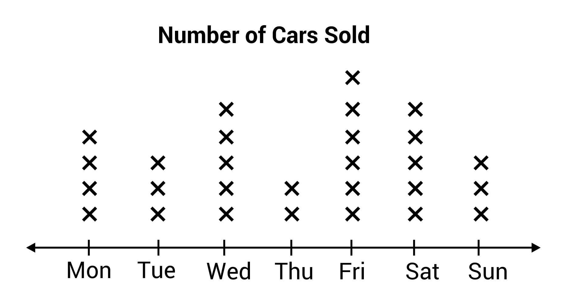
Three cars were sold on Tuesday, and five cars were sold on Saturday. The number of cars sold on Saturday is not twice the number sold on Tuesday.
Stephanie and Amber are working together on a math project. They need to represent the following data set in a graph, but they disagree on which graph would make the best choice, a line graph or a line plot. Stephanie says that line graphs and line plots are the same thing, so either one will work. However, Amber thinks that a line plot would be the best option. Who is correct?

Line plots and line graphs are both graphical displays for representing data; however, they differ in their use and purpose.
The purpose of a line graph is to show change over time, as in the growth of a tree over time. The line on a line graph is connected in order to show gradual increase or decrease.
In contrast, a line plot is used to show frequency. For example, the number of hours people watch TV in a day.
Overall, a line graph is used to show change over time, and a line plot is used to compare frequency. In this case, Amber is correct because the data set would be best displayed as frequency in a line plot.
Class sizes at Pacific Middle School are between twenty-five and thirty-five students. The line plot below shows the number of 6th grade students in each class. What is the mode, or most common, number of students per class?
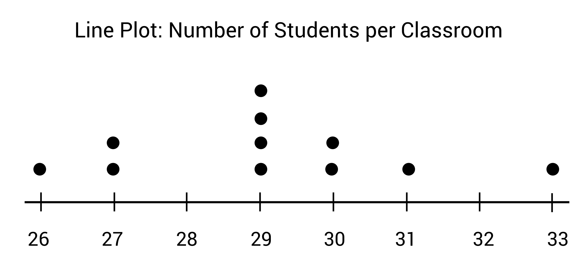
The mode, or most common number of students in each classroom is 29 students. Line plots can be very useful displays when looking for patterns in frequency, or clusters of data.