

It’s been said that a picture is worth a thousand words. This is true of the many different ways that data can be transformed into visual representations for easier interpretation.
Data in and of itself can be difficult to explain but when it is carefully organized, patterns can be revealed, or it may become apparent that no patterns exist. Either way, both results are meaningful.
Advances in technology enable us to collect and track data like never before, and interpretation of data is simplified with the use of graphs. Data is collected for many reasons, ranging from simple consumer surveys to track preferences, to election polling to predict the winner of a political office. Graphs are used to make that data easier to digest or comprehend.
Before we get to the graphs, you should know that there are different types of data that can be collected. The first one we’ll talk about is qualitative data.
Qualitative Data
This data would result from a survey that groups respondents by category. For example, you can survey students in your school and ask them to report their eye color, gender, area code, and favorite movie type. These categories provide information for your study.
In this case, maybe you’re wondering whether there is a relationship between the number of blue-eyed, sci-fi fans living in a particular area code. Well, you may be able to detect a pattern in the counts (or percentages) of qualitative data by category.
Graphs that are used to depict qualitative data are pie-charts and bar graphs.
Pie Charts
A pie-chart< looks exactly like what you might expect: a pie! A circle, representing 100% of a particular variable of interest, is divided into categories. Segments of the pie represent a percentage of the whole. Pie charts can also show counts. In this example, six people, or 30% of the respondents, favored romantic movies. 
Bar Charts
Bar charts also show counts (or percentages) by category, but in a different way. It looks like a city in the distance with skyscrapers at varying heights. This bar chart shows categories on the horizontal axis with the associated counts on the vertical axis.

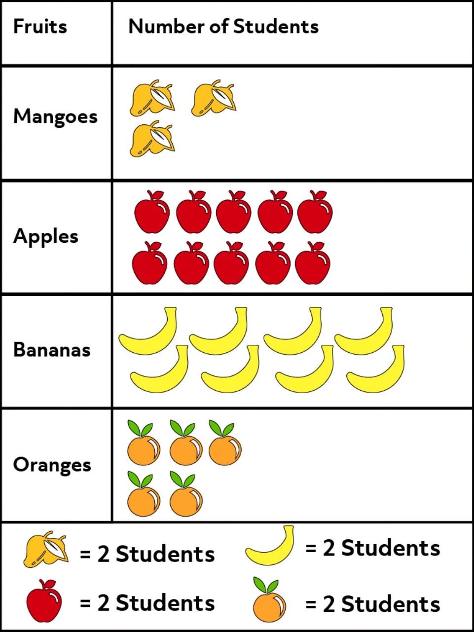
Pictographs
Next, we have pictographs. As the name suggests, a pictograph provides visual context. Visual cues and images are used to represent the data, and keys are provided to tell you what each image or symbol represents. In this survey of student fruit preference, apples took the lead with twenty students reporting them as their favorite.
Quantitative Data
Another type of data that can be collected is known as quantitative. Unlike qualitative data, you can do math with quantitative data because it is numeric in nature.
For example, what if you are interested in the average AP Statistics score of the graduating class of your high school?
Histogram
Gathering reliable data may be the trickiest part of your study, but a histogram can relay trends in the results with precision.
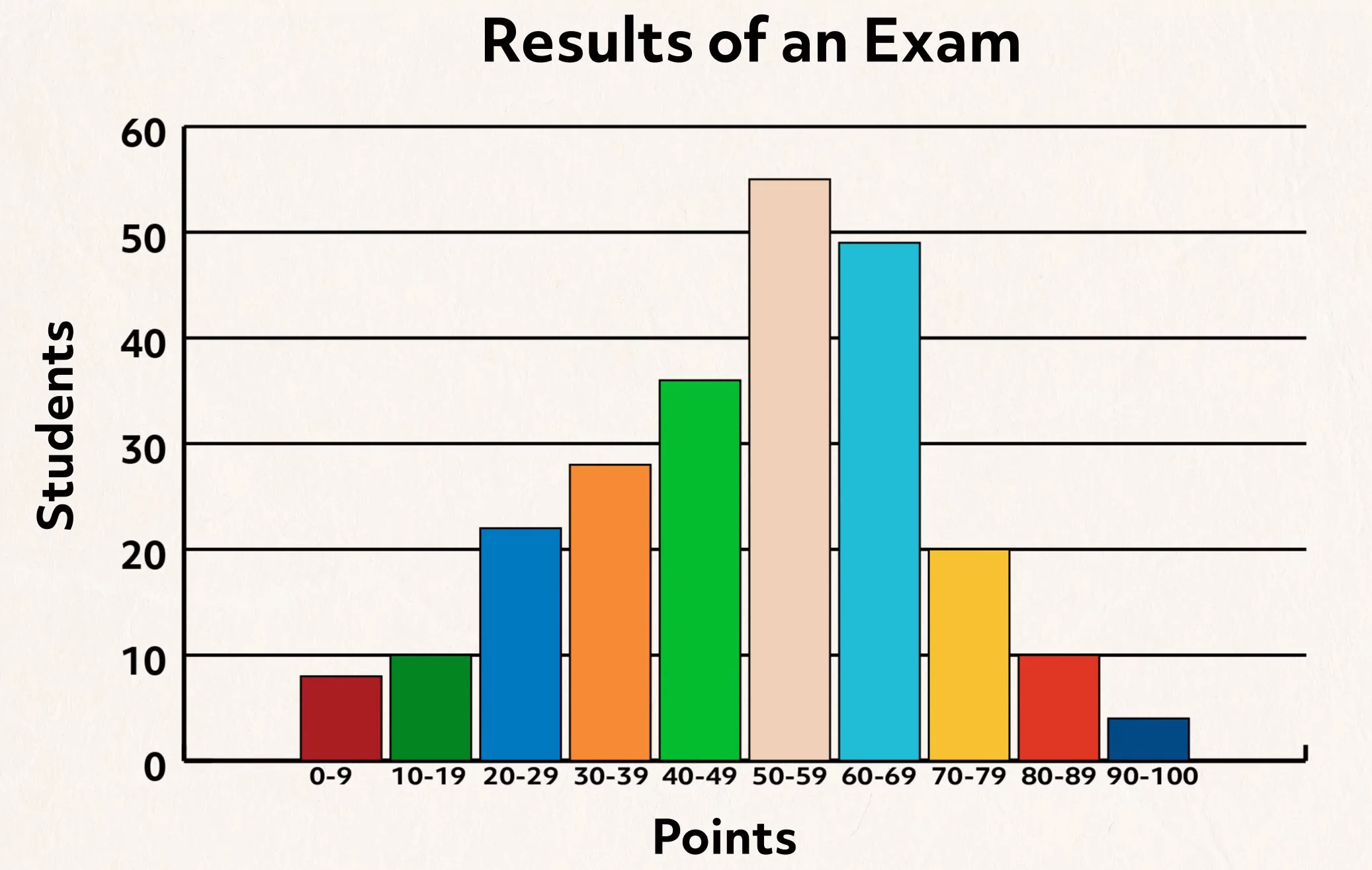
A histogram resembles a bar graph, with the exception of spaces between the bars. There is a range of numeric values displayed on the horizontal axis, and the counts of students are displayed on the vertical axis.
The pattern of scores may appear somewhat symmetric, which is typically referred to as “normally” distributed. This would suggest that most students scored in the middle of the range, and that there were some high achievers and others who were not so successful.
A histogram could also show a “skew” to the right or left, which may reveal information about overall student understanding.
Scatter plots show data points for two quantitative variables on the same graph. The pattern revealed could show an association between the two variables. The data is analyzed with respect to direction, form, and strength.
Direction can be positive if a rising pattern is seen in the data, or negative if a falling pattern is seen. The form of the scatter plot identifies whether the data appears somewhat linear, curved, or cone-like in shape. Strength associates how tightly the points are gathered. An example of a strong positive, somewhat linear pattern could be revealed in a scatter plot of shoe size versus height of male high school students.
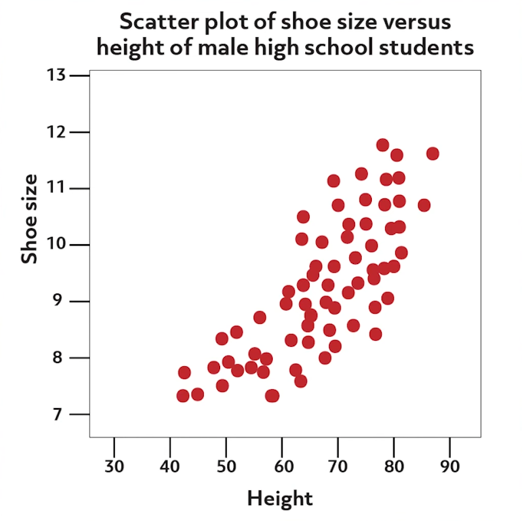
Because typical male students continue to grow during the high school years, the data for all male students would likely show underclassmen data points at the lower end of the scatter plot and upperclassmen represented at the higher end. Data points that do not fit a recognizable pattern are referred to as “outliers.” Finally, a scatter plot with no pattern at all is also of interest to prove no association between the two variables.
Regression Analysis
Regression analysis can be performed on scatter plot data that has been characterized as “strong linear” in shape and either positive or negative in direction. This regression line serves as a predictive model only for estimating other points of interest within the range of the data set.
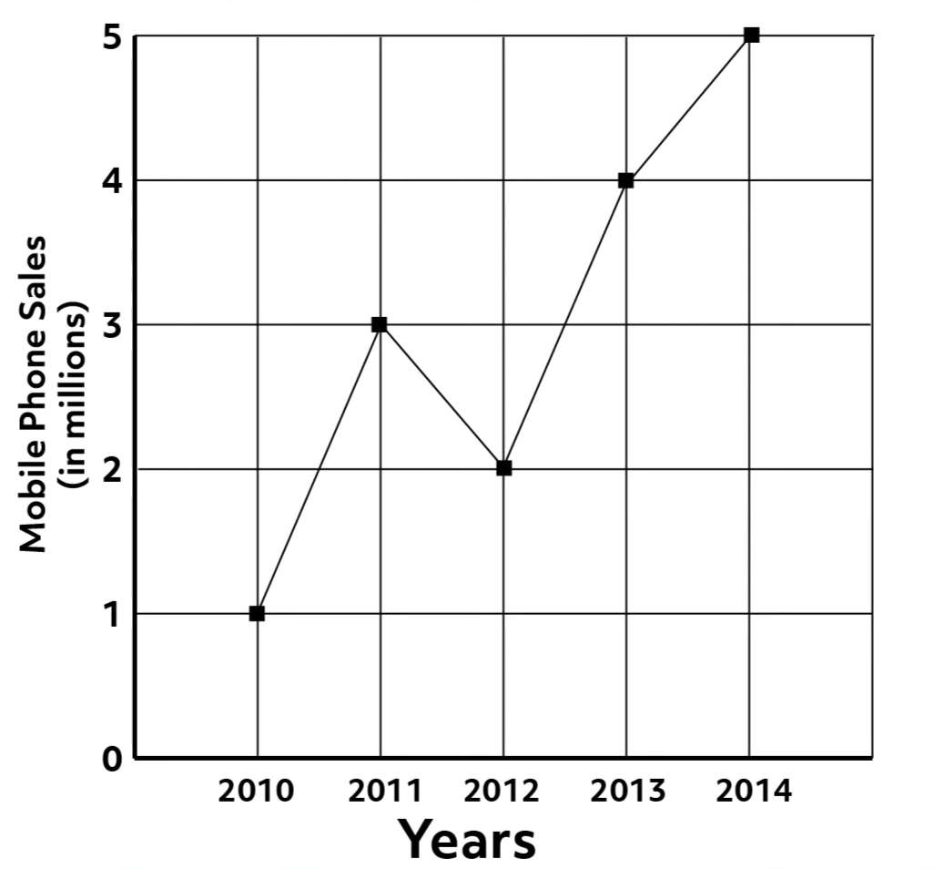
Line Graphs
Line graphs are very useful to recognize how patterns in datasets change over time. Unlike a linear regression model that runs through a set of points, a line graph connects the data points.
The graph of mobile phone sales over time shows an overall increasing pattern; however, there was a noticeable dip in sales between 2011 and 2012.
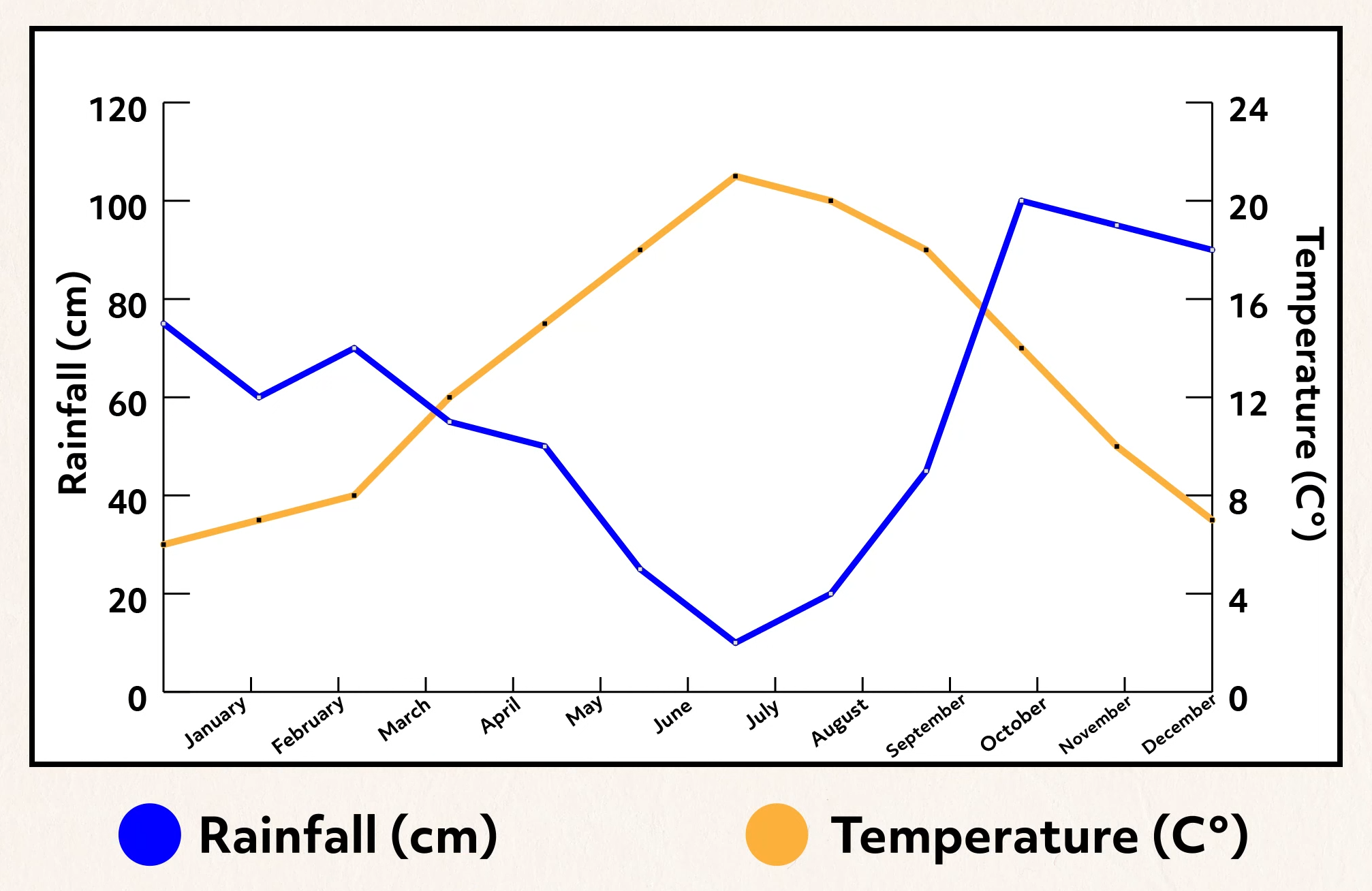
Graphing multiple variables together in a line graph can also be very informative. For example, suppose temperature and rainfall amounts in a particular region were graphed simultaneously. As can be seen, contrasting weather patterns are revealed.
Stem and Leaf Charts
Finally, stem and leaf charts contain actual data values. The pattern revealed is similar to that of a bar chart that has been rotated clockwise 90 degrees. The “stem” of the chart lists the digits of an indicated place value vertically.
In this example, the stem represents the “tens” of a data set of ages. The leaves branch outward with the digits of the “ones” place for each age in the data set. A key should always be part of the graph so the data can be interpreted correctly.
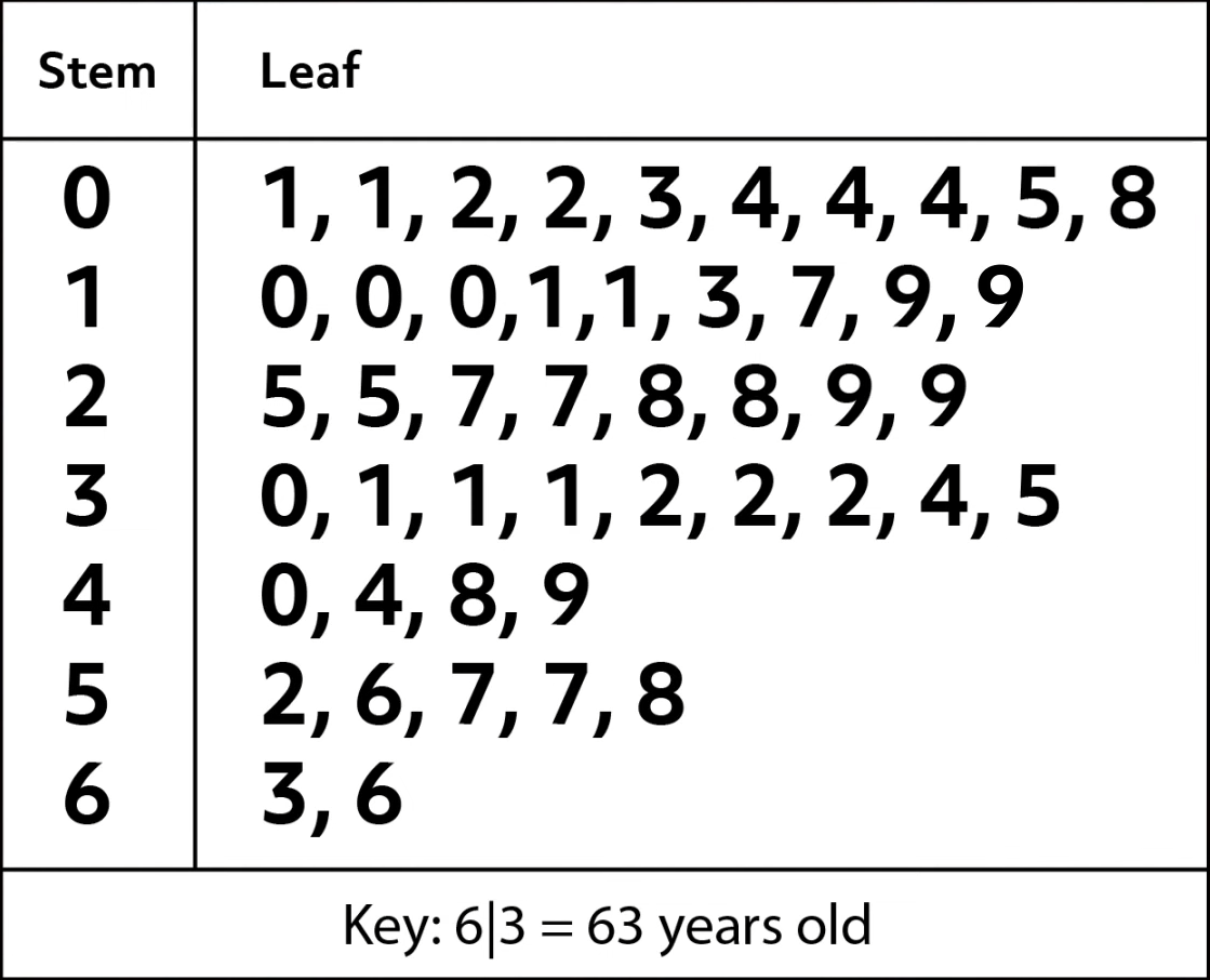
This data set shows a pattern that seems to be skewed left, towards the younger ages. There are 19 people under twenty and only 7 people over fifty.
Thanks for watching this overview of data interpretation. See you next time!
Data Interpretation of Graph Practice Questions
How are qualitative data and quantitative data different from one another?
Quantitative data is based on numbers, and qualitative data is based on concepts and characteristics.
Which graph would best illustrate a set of data on a class survey of each student’s favorite book genre?
This is a set of qualitative data because it describes the results of a class survey that groups respondents by category. A pie chart is often used to illustrate qualitative data.
Based on the bar chart shown, which statement is true?

According to the key, the green bars show how many girls participated in sports each year. In 2025 and 2026, the bars representing “Girls” each read as 35 for “Number of Students.” Therefore, the total number of girls is 70.
This scatter plot shows Monica’s training as she prepares for a 6-mile race. How could we describe the pattern of the data points?
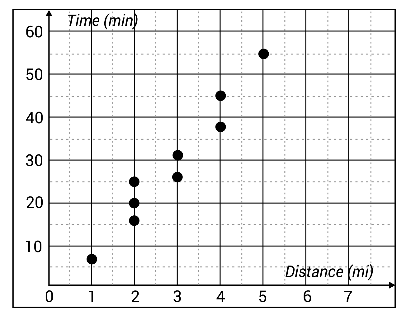
Since these data points are moving in an upward direction from left to right, it is positive. Since most of the data points would fall on or near a straight diagonal line, the shape of the graph is described as linear.
Hillary and Stephen want to keep track of the different kinds of cupcakes they bake over the course of seven months. Hillary says they should track their data using a pictograph, but Stephen says they should use a stem and leaf chart. Who is correct, and why?
The scenario described represents the collection of qualitative data. A pictograph best illustrates qualitative data, and a stem and leaf chart best illustrates quantitative data.