
Hey guys. Welcome to this Mometrix video on how to plot a line graph.
What is a Line Graph?
First things first. What is a line graph? A line graph is a type of chart that helps you to visualize the relationship between two variables. Most often it is the rate of change over time.
You may also have multiple sets of data graphed on one line graph if the same two variables are related.
How to Make a Line Graph
So now, how do you actually make a line graph?
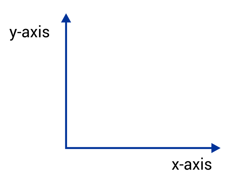
Well, first start by drawing a cross on your paper or whatever you are writing on. The two separate lines represent your \(x\) and \(y\) axes. The \(x\) axis is the line that runs horizontally, and the \(y\) axis is the line that runs vertically. Always label your axes!
Next, you need to identify which portion of your data goes on which axis.
So like in this set of data, which column would go on which axis?
| Time (months) | Height of tree (inches) |
|---|---|
| 1 | 24 |
| 3 | 31 |
| 3.5 | 34 |
| 4 | 37 |
| 6 | 50 |
| 7 | 55 |
| 9 | 73 |
| 12 | 101 |
Your independent variable should always be on the \(x\)-axis, and your dependent variable should always be on your \(y\)-axis.
Often times when working with graphs the data you are given is dealing with the rate at which something changes over time. Well, this makes it easier for you to identify your dependent and independent variables. Because time is always independent. You can’t do anything to affect time. You’re constrained by it.
However, like with our data in this case, we can affect the growth of a tree within a given amount of time by manipulating certain variables like soil, fertilizer, catalysts’, temperature, and so on.
So, for this set of data we know that time is our independent variable, so it goes on the \(x\)-axis, and the “height of the tree” is our dependent variable, so it goes on the \(y\)-axis.
I hope that this video was helpful.
See you next time!
Line Graph Practice Questions
Marco recorded the temperature in his city on the first day of every month. He wanted to create a line graph with the data, but he is unsure where to place each variable. Which statement below shows the correct location for each variable?
In this scenario, the temperature is dependent on which month it is. Therefore, the temperature is the dependent variable and the month is the independent variable. In a line graph, the independent variable is placed on the x-axis, and the dependent variable is placed on the y-axis.
A biologist has been studying the hippo population near a small village in Tanzania. Based on the line graph below, what is the difference between the hippo population from 2007 to 2010?
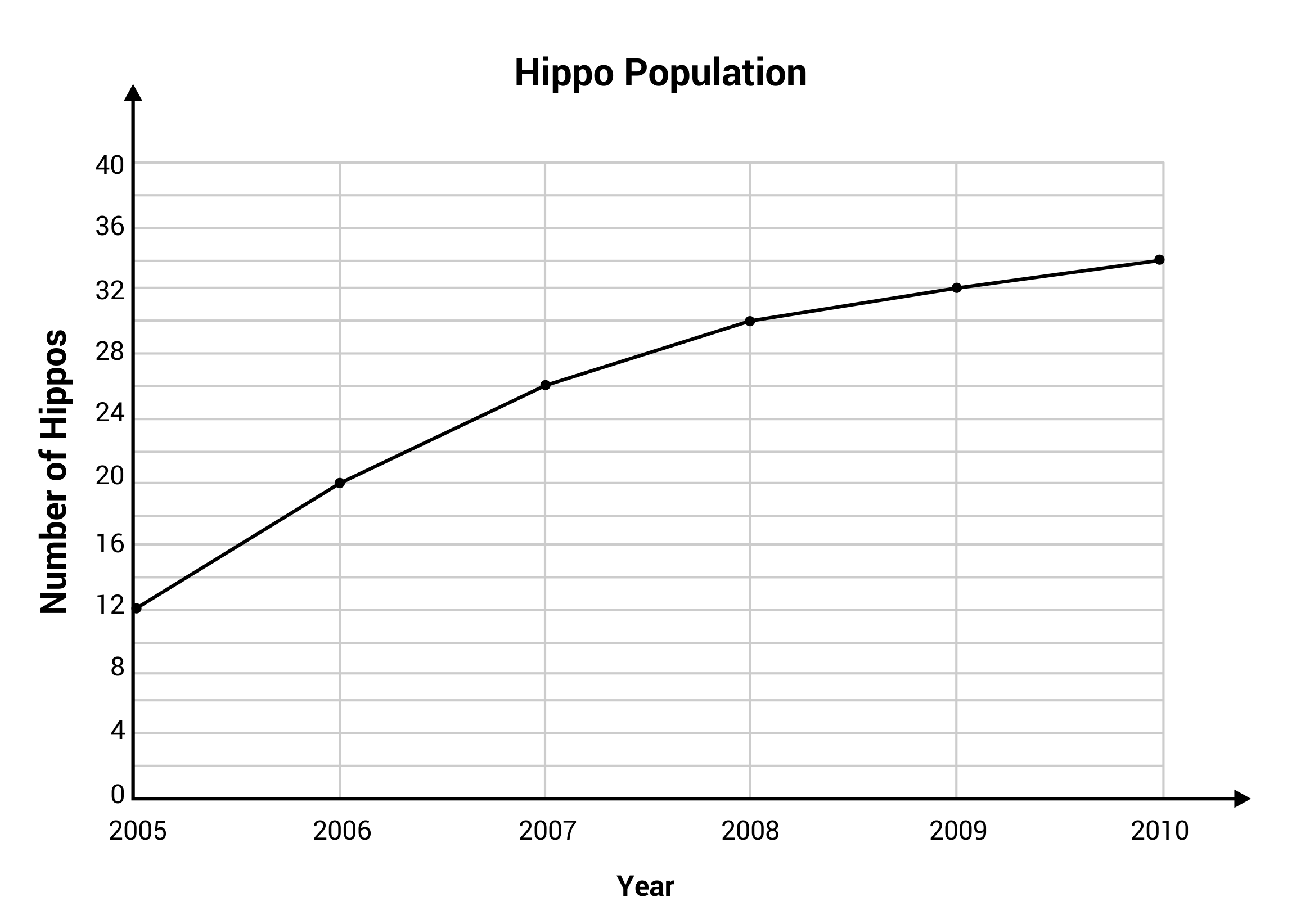
The number of hippos in 2007 was 26, and the number of hippos in 2010 was 34. The difference can be calculated by subtracting 26 from 34. The line graph shows an increase of eight hippos from 2007 to 2010.
The graph below shows the distance traveled by a bus during one school day. What does the highlighted region from Hour 1 to Hour 2 indicate?
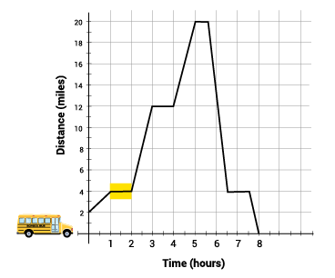
The flat line indicates that time is continuing to pass, but the line does not raise up, which indicates that distance is not increasing from Hour 1 to Hour 2. This tells us that the bus is not moving.
Diego is creating line graphs for a math project. He has created the graph below, but the titles for the x– and y-axis were accidentally deleted. Which option below is the most logical match for the x– and y-axis, based on the information that is displayed?
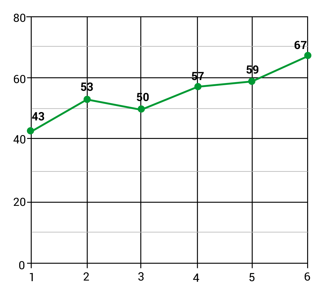
The most realistic match would be to place Temperature on the y-axis, and Month of the Year on the x-axis. The graph shows gradual temperature shifts from day to day, and a slow increase of temperature from month to month (except between Month 2 and Month 3, where there is a slight decrease). The other scenarios have little relevance to the data points that are displayed.
How many years did it take for the world’s population to grow from two billion to three billion people?
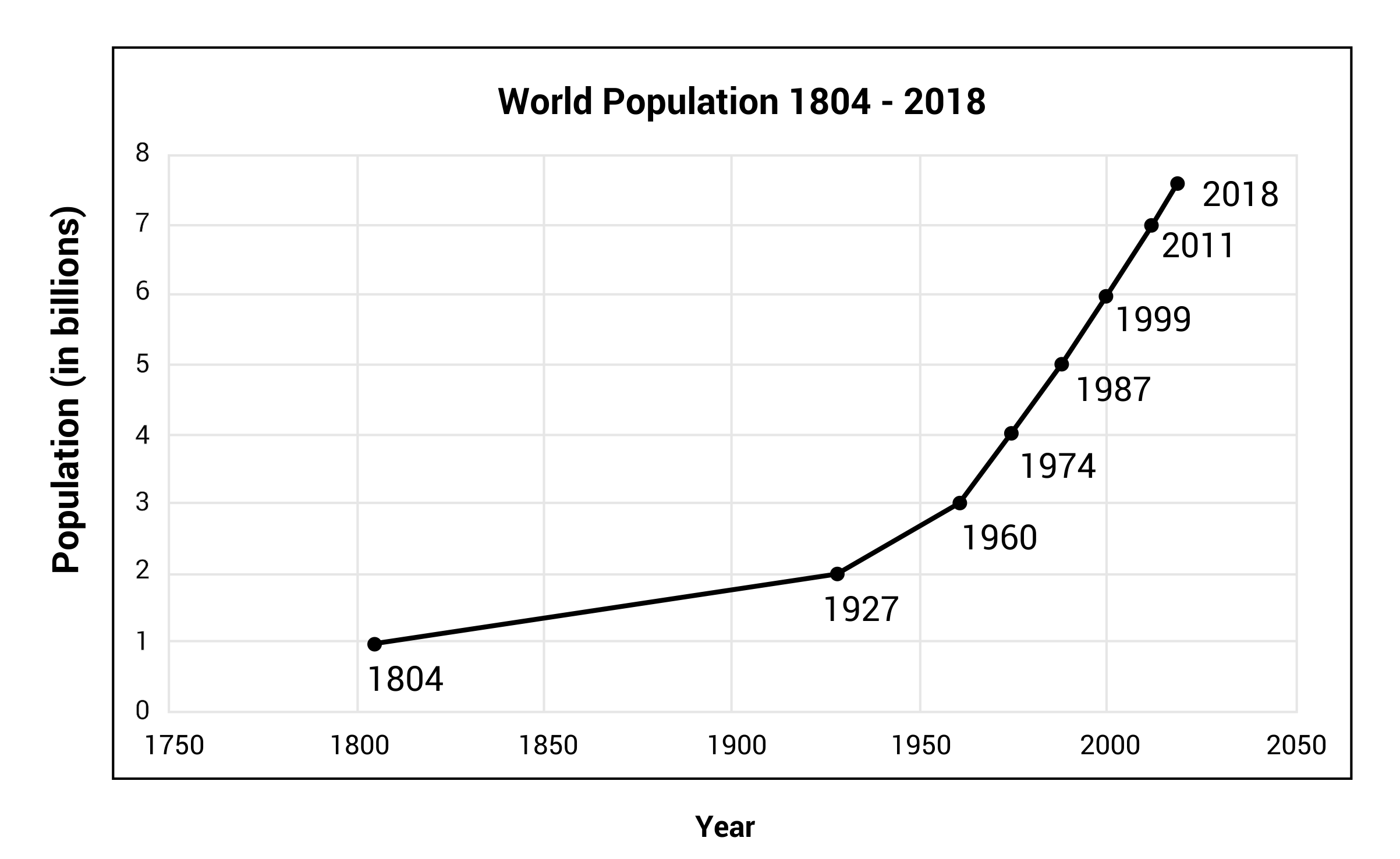
The world’s population was two billion people in the year 1927 and three billion people in the year 1960. This is an increase of one billion people, occurring over 33 years.