

Hey guys! Welcome to this video on scatter plots.
What is a Scatter Plot?
A scatter plot is a helpful tool that allows us to see the relationship between two variables, or to see that there is not a relationship between two variables.
Analyzing Data
Let’s take a look at a few different tables of data, see how to graph each, then look at the relationship between the two sets of data.
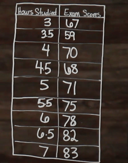
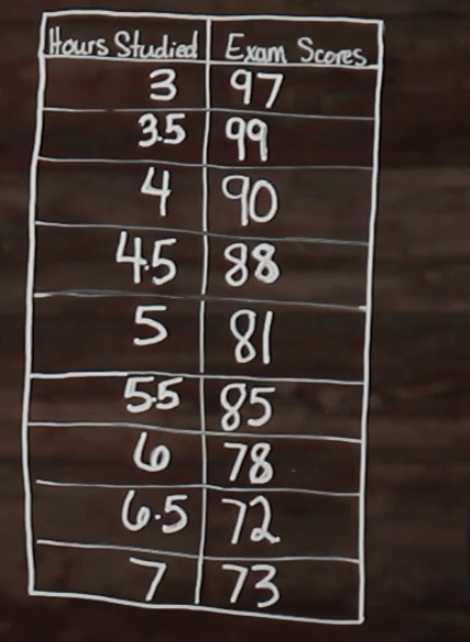
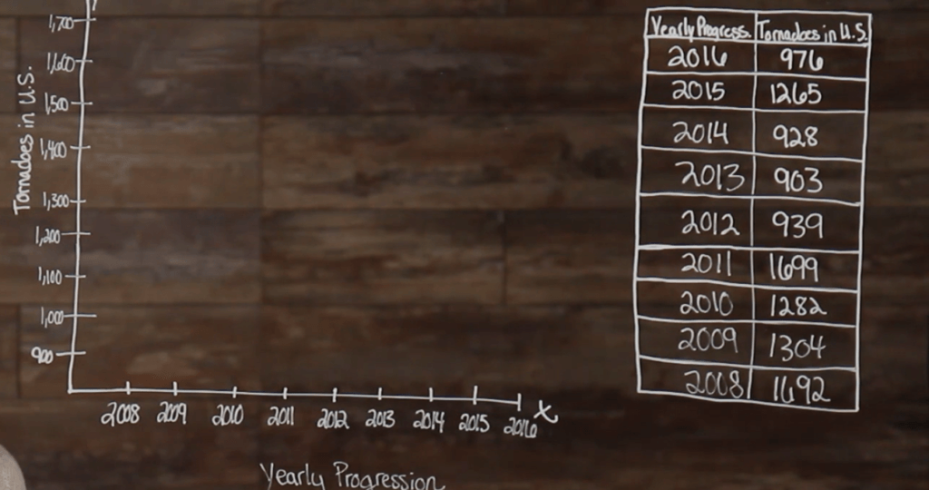
So, we have our table of data here. Now, let’s look at how to graph it. So, we are going to set it up exactly like we would a line graph. We need our x– and y-axis.
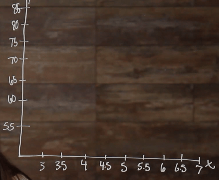
Then we need to fill in our number lines. We know that time is our independent variable because time is always the independent variable, so time will go on our horizontal axis here, and exam scores will go on our y-axis.
Now, that we have our numbers on each axis, we can begin to plot our points. So, plotting points works the same as it would when plotting a line graph. We find our first number of data points that lies on the \(x\)-axis and go up the corresponding amount on the \(y\)-axis. So, for our first point we have \((3, 67)\). Then we do the same thing for each of our other points.
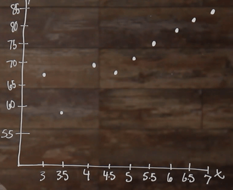
Great! Now that we have all of our points plotted, we are able to take a look at the relationship between the points. We can see that, overall, as the hours of study time increase, the exam scores also increase. There are a few outliers, like our 3.5 right here and then our 4.5; but over all, we can see that as one variable increases, the other variable also increases. When both variables are increasing, this is said to be a positive relationship.
Line of Best Fit
Another way to see what type of relationship we have among our data points is by drawing what we call, a line of best fit. When drawing a line of best fit, you need to draw a line that represents the general, or average, trend between the data points.
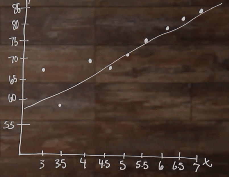
So, you can see that this line has a positive slope because it’s going upwards, which means that it has a positive relationship.
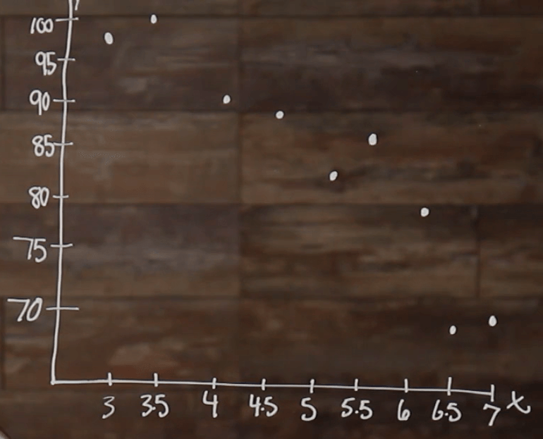
Now, let’s take the same table, and change up our exam scores a little bit.
Now, let’s plot our new data points.
In this scatterplot, we can see that we have a negative relationship, overall, between our two corresponding variables. As the study time increases, our exam scores decrease. Again, another way to show this would be to draw a line of best fit to represent the average trend of data.
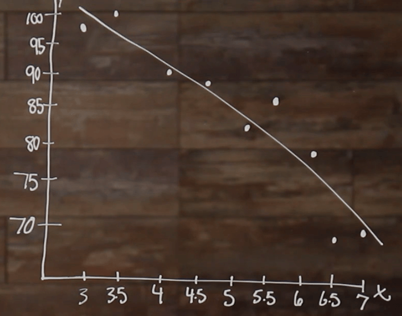
When we draw our line of best fit for this set of data, we can see that the line has a negative slope; which means that there’s a negative relationship.
Now, let’s take a look at one last example.
So, we need to plot our points the same way that we plotted the last two.
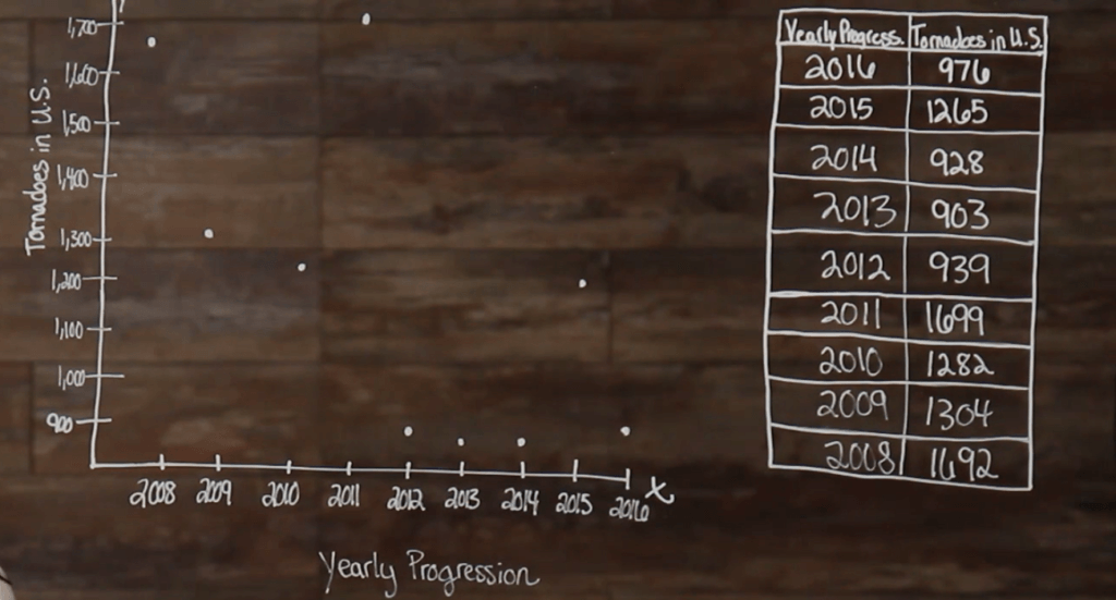
We can see that in this example that there doesn’t appear to be an overwhelmingly positive or negative relationship. When you have a scatter plot that doesn’t have a positive or negative relationship, it’s said to have no relationship. So, it would appear that there is no correlation, or relationship, between yearly progression and tornadoes in the US.
I hope that this video has been helpful to you.
See you guys next time!
Scatter Plot Practice Questions
According to the scatter plot below, is there a relationship between the hours spent practicing piano, and the number of incorrect notes played?
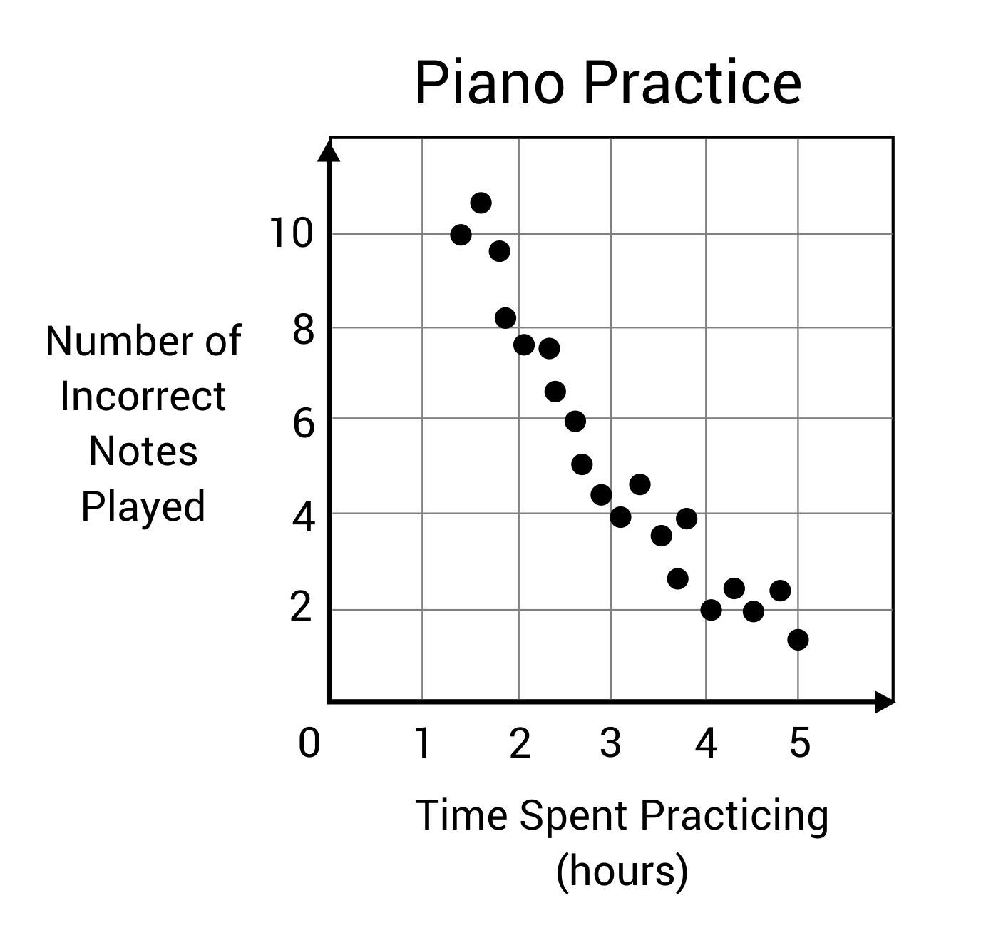
If a line of best fit is drawn over the data points the slope will drop from the top left down to the bottom right. This creates a negative slope, meaning there is a negative correlation between the two variables. Incorrect notes will decrease as hours of practice increases.
Describe the correlation between the independent and dependent variables in the scatter plot below.
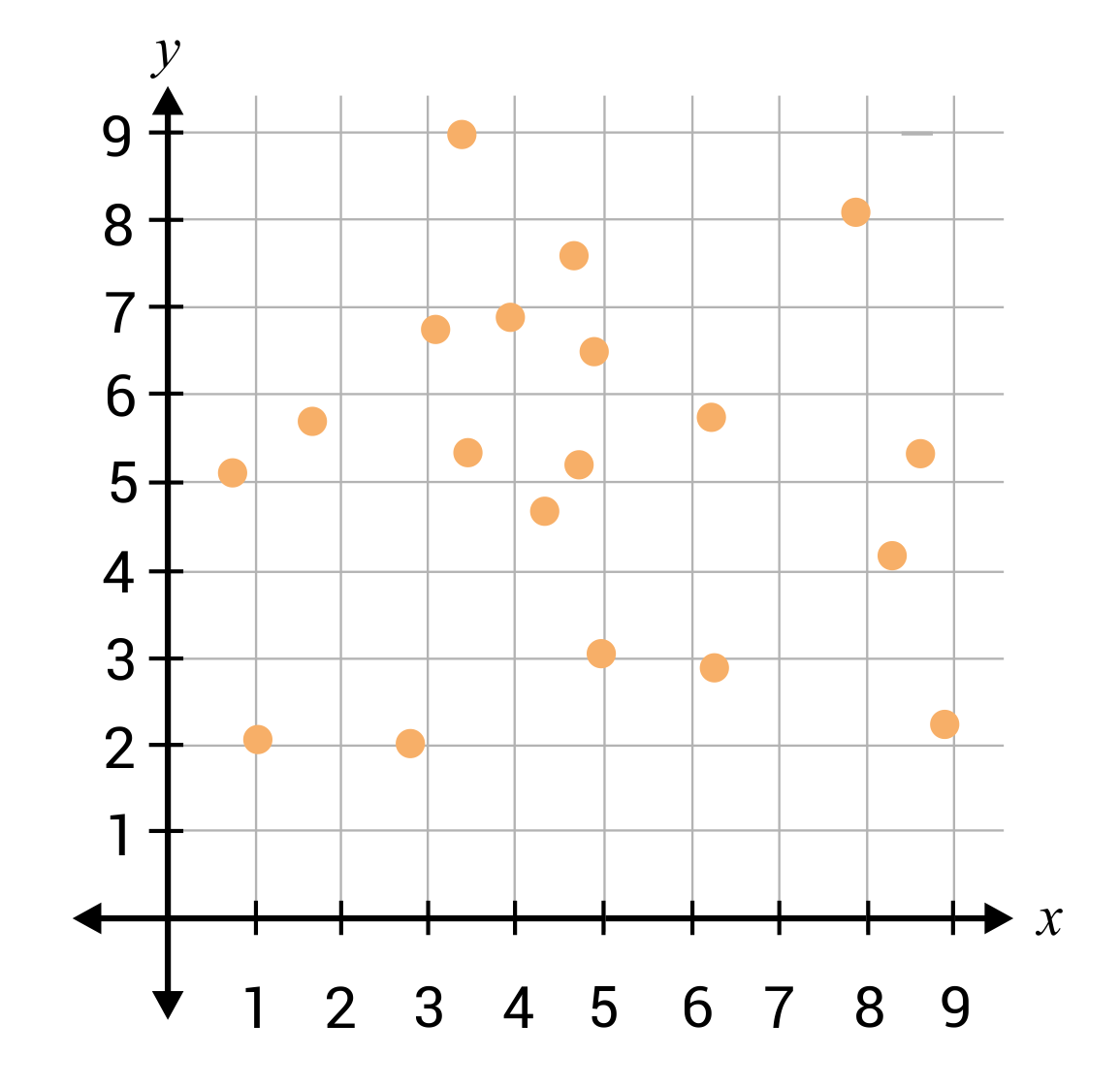
The data points are spread out fairly randomly on the scatter plot. There are no trends or patterns, so a line of best fit cannot be drawn. The variables have no correlation, or relationship to each other.
Jesse is tracking the correlation between the amount of time someone studies for an exam (\(x\)-axis), and their score on the exam (\(y\)-axis). He plots the points on the scatter plot below, and he wants to draw a line of best fit. Which line would be most appropriate for the data points?


The line of best fit, or trend line, should be drawn over the data points in a way that most accurately represents the slope of the data. Graph C shows a line of best fit that closely matches the trend of the data.
All of the scenarios listed below, except for one, have a direct correlation. Which scenario has no correlation, or relationship, between the two variables?
In general, a person’s height has no correlation to the number of fingers they have. These two variables do not have a direct relationship, and on a scatter plot no clear line or trend would be noticeable.
A scatter plot would be the best graphical display for which of the following scenarios?
Scatter plots can be very useful displays for identifying trend lines or correlations between two variables. Large numbers of data points can be placed on a scatter plot, so trends and relationships are generally clear to see when a line of best fit is drawn.
Choice B describes a scenario where bar graphs would be a useful display.
Choice C describes a scenario where a pie chart, or circle graph, would be a useful display.